
tldr: Drawing a chart is tough when you are new. Here are 10 simple steps to help you succeed when performing technical analysis for the financial markets.
Learning A New Language
Learning technical analysis for the financial markets is like learning a new language. Essentially, you are learning to understand the language of the markets. Make no mistake, the markets talk, you just need to know how to listen. Unlike a language though, this is a one way street. A street where the market talks and we listen. Its not a debate and no amount of talking from our side will help us “win”.
There is a saying in trading:
“Do you want to be right, or do you want to make money?“
Although we can’t talk back, we can listen and we can follow. This is the best way to participate.
In this article, I’m going to tackle one of the most daunting parts of learning to trade – drawing a technical chart. Luckily, with the help of advanced charting tools like we offer for free at TradingView, the physical act of drawing on a chart is not so difficult.
Drawing on a chart effectively and in a way that tells a story, however, is an entirely other matter. It requires the right process flow, just enough drawing and an eye for detail. At the same time, it also requires pattern recognition and an ear open to what the market is saying – even if its not what you expected!
I have previously worked for TradingView for a number of years professionally and have been in the trading and investing space since before the GFC. Over this time I have learned a lot about technical analysis and I’ve made a lot of mistakes along the way. Now, I have a strict flow that I follow – and I hope to share this with you today.
So, let’s tackle this together and effective draw a chart.
Ps Want to practice your TA with Crypto? Get $20 Free Bitcoin thanks to Swyftx by signing up for free. Be sure to claim the bonus within 7 days inside the rewards part of the platform/app after verification is complete. This is important, or it will expire! Swyftx has TradingView charts integrated, so you can practice your Technical Analysis while you trade!
Now, lets get started!
Welcome to The Technical Analysis Process in 10 Steps
Step 1 – High Timeframe
Step 1 is more of a reminder than anything else because it’s so frequently missed. It’s also a step that’s very important to me personally. Start on a high timeframe.
It’s a mistake that I’ve seen so many times. If you come in and look purely at a low timeframe it’s so easy to get wiped out by the direction of market. You just don’t see it coming. Its the equivalent of looking down a rifle scope and not opening your eyes. Anything can come from the side and you won’t see it until it’s too late. You have no peripherals.

Timeframes
You’ve got to be aware of what’s happening. I suggest starting quite high such as the weekly timeframe, particularly for the traditional and well established markets. If the market is new, so you might be able to get away with starting on the daily timeframe.
Direction
Without drawing anything, we now basically just want to look at the chart and form an opinion of direction. Luckily, you don’t really need any experience to do this. We simply want to ask ourselves if the overall movement looks like its going up, down or sideways. Quite simple, yet critical. The market needs to tell us which way its going. Remember, our role is to listen and follow.

Extra tip, once you have looked at the charts using Candlesticks, switch to Line Chart instead to really clarify what you are seeing.
Step 2 – Support & Resistance
When performing technical analysis of the financial markets, support and resistance is the first drawing step is because support and resistance zones or lines are some of the first building blocks of market structure. They represent price levels, which is the base of everything.
You’ll notice that some traders only trade shapes, zones or break outs, however it’s all related to support and resistance. So trends are important to understand direction, yes, but as an initial step we want to start with drawing horizontal lines.

Drawing the Lines
Firstly, begin by drawing a support support line directly below the current price at the next level or support and don’t skip any levels. Next, do the same for resistance (unless you are in price discovery). For those who don’t know what price discovery is, its when price it at all time highs and we have no previous structure to refer to.
Next, repeat the same process again for the next level below and above. You should now have 4 lines on your chart (unless you are in price discovery)
Using Zones
Many times with drawing lines, you will discover that a single line doesn’t adequately or accurately place itself well. In this case, you should be comfortable with drawing a zone instead of a single line.

Zones can be drawn using a rectangle, and this helps when you have a lot of movement around a support or resistance zone, such as volatility of candles that are particularly “wicky”
Step 3 – Trend & Direction
Let’s move onto Trends.
Remember how we started on a high time frame with a blank chart to find direction? Now we need to draw that in. Using a trendline, draw the overall trend. You can draw both a bottom and a top line or even use a channel. You can also look for any “inner” trends that may have formed. This can sometimes happen especially when you are on high timeframes such as a weekly chart.
You chart should look something like this:

Step 4 – Shapes & Formations
Note here, this step is optional. Personally, I do use shapes when I trade, but everyone is different. So, if you are starting out and feeling overwhelmed, this is something you can revisit more in time.
What to look for
In this step we are going to look at the chart we have drawn and see if we can find any obvious shapes or patterns.
Can you see a triangle? A rectangle? A wedge. A flag? No matter which it is, mark it out. Don’t force it. They are either there or they aren’t.
Let’s take a look at the demo chart and see if any exist:

Don’t worry if you can’t see patterns right away, they come to you naturally over time.
Extra tip – shapes don’t have to be perfect. When they are a bit rough, we call them “dirty”. The important thing is what the shapes represent, as many of them represent the same thing.
In the chart above, we see a potential “falling wedge“. A reminder for those who don’t know, the “textbook” theory of a falling wedge pattern is shown below:

Step 5 – Indicators
Note here, this step is optional. Same as step 4. I do personally use some indicators, however I’ll limit it to 1-2 at a time so as not to cause confusion. You may wish to use more, less or none. An indicator should help with confidence ratings, supporting or objecting to what you are seeing on the chart itself.
Important point here too – Indicators are less important that market structure. Market structure is king/queen/overlord.
So, in this step we can now go ahead and add our favorite indicators. If you are new, I’d recommend sticking to 1-2 at time, just to get used to what you are seeing. Each indicator has been produced for a purpose, so be sure to understand how they are produced and why. Lastly, indicators are a little subjective. The way I interpret an indicator may be different to another person. Lots of practice is what you need.
You chart may now look something like this:

The purpose of this step is to place the indicators in order to supplement your drawings.
In the next step we are going to begin some interpretation.
Step 6 – Read The Story
We have now arrived at the first stage of interpretation. Congratulations on getting this far!
Our job here in Step 6 is to read the story and see what the market is telling us. As people, we respond incredibly well to stories. So, the more you can tell yourself a story based on the charts, they better the trader you will be. We can do this by asking ourselves some key questions which are going to help paint a picture.
Key Questions (examples)
- Which direction is price moving in?
- Is price held above support?
- Is price trapped below resistance?
- Is price inside the existing trend?
- Has the trend broken?
- If I have shapes, what do they mean?
And lastly, one more important question if you have used Indicators:
- Do the Indicators agree or disagree with my analysis?
Example answers to Key Questions, related to previous demo chart
- Which direction is price moving in?
- Overall, It’s moving upwards.
- Is price held above support?
- Above most recent support, but struggling.
- Is price trapped below resistance?
- Yes, seems to have bounced off and be trapped below resistance.
- Is price inside the existing trend?
- Yes, if we extent the trend line up, its still inside.
- Has the trend broken?
- No.
- If I have shapes, what do they mean?
- Falling Wedge is a bullish continuation pattern during an uptrend, but it already broke and continued. No current forming or breaking patterns to refer to.
- Do the Indicators agree or disagree with my analysis?
- MACD has recently crossed down, suggesting bearish pressure. RSI is also pointing down, suggesting bearish pressure. Overall, both indicators seem to be counter to the overall uptrend. This reduces confidence.
In this step, while you tell yourself the story, you need to be looking for “confluence”. This means that you should look for multiple factors that could point to the same answer. For example, are 2,3,4 things suggesting price is bullish? The more the better – but don’t force it! You are not creating the story, you are reading the story that’s already written. Be mindful here.
Step 7 – Form an Opinion
This step is quite an easy one. We have the chart and we have the story, now we need to form an opinion. Ask yourself a couple of key questions, provide your response and also if possible give it a star rating out of 5.
Key questions:
- Where is price telling me it wants to go?
- How confident am I about this?
- What would I rate it out of 5 stars?
For example, here are a couple of response sentences:
- Price is bullish, and I’m very confident it will continue. 5 stars.
- Price is bullish, but looks a little dicey. I don’t feel good about it. 3 stars.
- Price is neutral and maybe even bearish. I’d rather watch from the side. 1 star.
In the case of our example chart, let’s write a sentence of our own:
“Price is bullish, inside the trend and showing a falling wedge recently broken upward. Indicators however are bearish. Overall its a bullish scenario, but only if the trend line holds (I want to see it bounce and hold) and ideally price will rise and break resistance as well. I’m not so confident it will continue in the short term, but I’m going to watch and wait until I see more confirmation, with clear signs of a reason to enter a trade. 2.5 stars.”
Step 8 – Risk Management
Although we have finished drawing and analyzing, we are not yet able to simply take the trade.
One of the most important factors in the whole trading game is here – Risk Management.
Even if you are 100% confident that the chart you have drawn is headed “to the moon”, this doesn’t mean you are able to take the trade just yet. We know the chart is relatively bullish overall, but with some bearish pressure, at least right now. This pressure will either fade and the chart will keep going up, or it will force something to change, such as a break in the trend line, support, etc. Our Risk Management practices are what allow us to or prevent us from acting on our analysis.
The Risk to Reward Ratio is the best friend of a sustainable trader. Every trade should be assessed, no exceptions. Well, if you don’t want to blow up your account quickly, anyway.
If your trade plan for example dictates that you need a minimum of “1:2” risk to reward, this must now be checked.

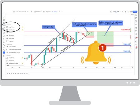
The Risk Summary
Referring to the chart above, we can see that a potential profit target if we entered right now would just be 1:2, which is a bare minimum (according to the example trade plan minimums). However, if for example the bearish pressures caused the trend line to break and price action fell back to a support zone, there would be an opportunity to look at a 1:3 ratio, or more. This would represent a better opportunity.
It’s important to remember that price could go either way. There are no guarantees and risk is always present. We just want to limit that risk even more, to be more sustainable overall. Technical analysis of the financial markets is a skill that takes time to develop. You can get better at drawing charts and trading, but you can never fully remove risk.
Remember, the ratio relates to the target as a reward and the stop loss position as a risk.
A statement could be made as follows – “I’m confident this is a good trade opportunity, but only if I can enter at the right price“
Step 9 – Timing & Alerts
We have established that now may not be the right time to take a trade, so what do we do in the meantime?
We set alerts and wait.

Using TradingView set alerts on or near to the are where you wish to enter the trade. These alerts should be detailed to remind yourself why you were waiting and what is needed for final confirmation.
Its important to write a detailed note to yourself because a trade might take some time to hit your ideal entry zone, particularly in the case on longer term trades on the daily timeframe. Days or even weeks could go by after you draw your chart, so make it easier for yourself later.
Now you wait! While you are waiting, go draw more charts!
Step 10 – Trust & Respect Yourself
If you are serious about technical analysis of the financial markets and trading in general, you need to respect yourself. This means respecting your analysis, your time and your opinion. Its not easy to trust and respect yourself especially if you are used to just being told what to do by others (in the case of “hot” tips on social media etc). However, its important that you take it seriously.
If you have spent all this time to find a trade, draw a chart, check your risk and set an alert – be sure to take the trade when it comes round! There is no sense drawing charts for the sake of drawing. They become art rather than an investment tool.
Respect yourself, respect your time and respect your analysis. As long as your risk is managed and you aren’t putting more than you can afford to lose into the market, you should feel confident in acting upon your own work.
Remember, nothing guarantees a win though. No matter how much work you do, the trade could still go in a direction that you didn’t expect – this is why we manage risk.
Technical Analysis of the Financial Markets – Practice Charts!
I’ve added some TradingView charts below, ready for you to practice your own technical analysis of the financial markets!
Don’t forget to create a free account on TradingView as well, so you can be part of the community.
Thanks for reading and I hope this article has been helpful to get you started on your Technical Analysis journey!
Want to start trading Crypto? Get $20 Free Bitcoin thanks to Swyftx by signing up for free. Be sure to claim the bonus within 7 days inside the rewards part of the platform/app after verification is complete. This is important, or it will expire! Sywftx has TradingView charts integrated, so you can practice your Technical Analysis while you trade!


Leave a Reply